Kids Cooking App UX Case Study
Tiny Chef
Kids Cooking App UX Case Study
The Product:
Welcome to the Tiny Chef kids cooking app UX case study. As part of the Google UX Design Professional Certificate, this project explores educational and accessible mobile experiences tailored specifically for young learners. Furthermore, it focuses on overcoming the unique challenges of pediatric culinary education.
My Role:
As a senior designer, I led the end-to-end UX/UI process. Specifically, I focused on creating an intuitive interface for non-readers. Consequently, the design utilizes gamified elements and safe, guided environments to help children explore kitchen skills effectively.
The Goal:
The project aims to foster interest in nutrition through a highly accessible child-friendly interface. In addition, it combines rigorous educational standards with engaging, interactive UX patterns.
Tools:
Figma, Photoshop, Illustrator.
The Problem: Designing for Kids
Many educational apps for young chefs overlook essential user needs. For instance, they often lack dietary guidance or optimized mobile experiences for children. As a result, parents struggle to find safe platforms that combine culinary education with a truly intuitive kids cooking app UX.
The UX Goal
Specifically, the project aims to develop a user-centered kids cooking app UX. This involves integrating culinary guidance and nutritional insights into interactive lessons. Ultimately, the app makes learning an accessible and engaging mobile experience for all children.
The Kids Cooking App UX Design Process
User Research & Insights: Initially, I researched the market for children’s cooking apps. A significant finding was the need for platforms accommodating non-readers. Tiny Chef addresses this by prioritizing voice-assisted learning and clear visual hierarchies. Moreover, it includes specific dietary filters for family safety.
Persona Development: Furthermore, I utilized qualitative data to build user personas. These informed every UX decision throughout the project. Consequently, features such as visual searches and allergy filters were directly aligned with the specific requirements of our young audience.
Wireframing & Prototyping: The initial foundation focused on mobile-friendly navigation. These sketches evolved into digital wireframes in Figma. For instance, I implemented a color-coded difficulty system. This helps children select recipes based on their confidence level and safety requirements.
Final Handoff: Ultimately, the high-fidelity phase focused on the final interface. I prepared handoff specifications, including component libraries and accessibility audits. These documents ensure the app maintains its structure across devices. In addition, typography scales were defined for maximum legibility.
Understanding the User
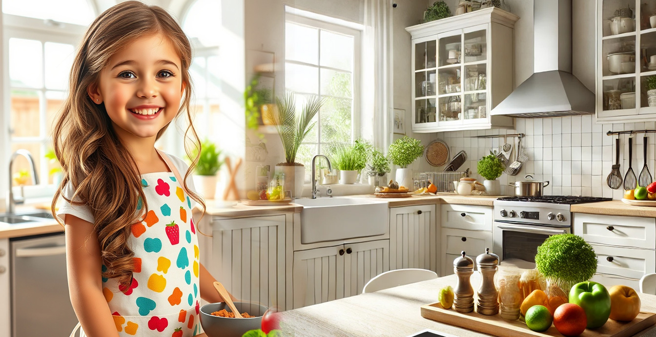
Lily McAllister (8 years old)
Lily is an 8-year-old aspiring chef eager to explore cooking. Since she is still developing motor skills, she responds best to visual activities. A thoughtful kids cooking app UX design helps her follow recipes with interactive elements. Consequently, she builds confidence while sharing her work with her family.
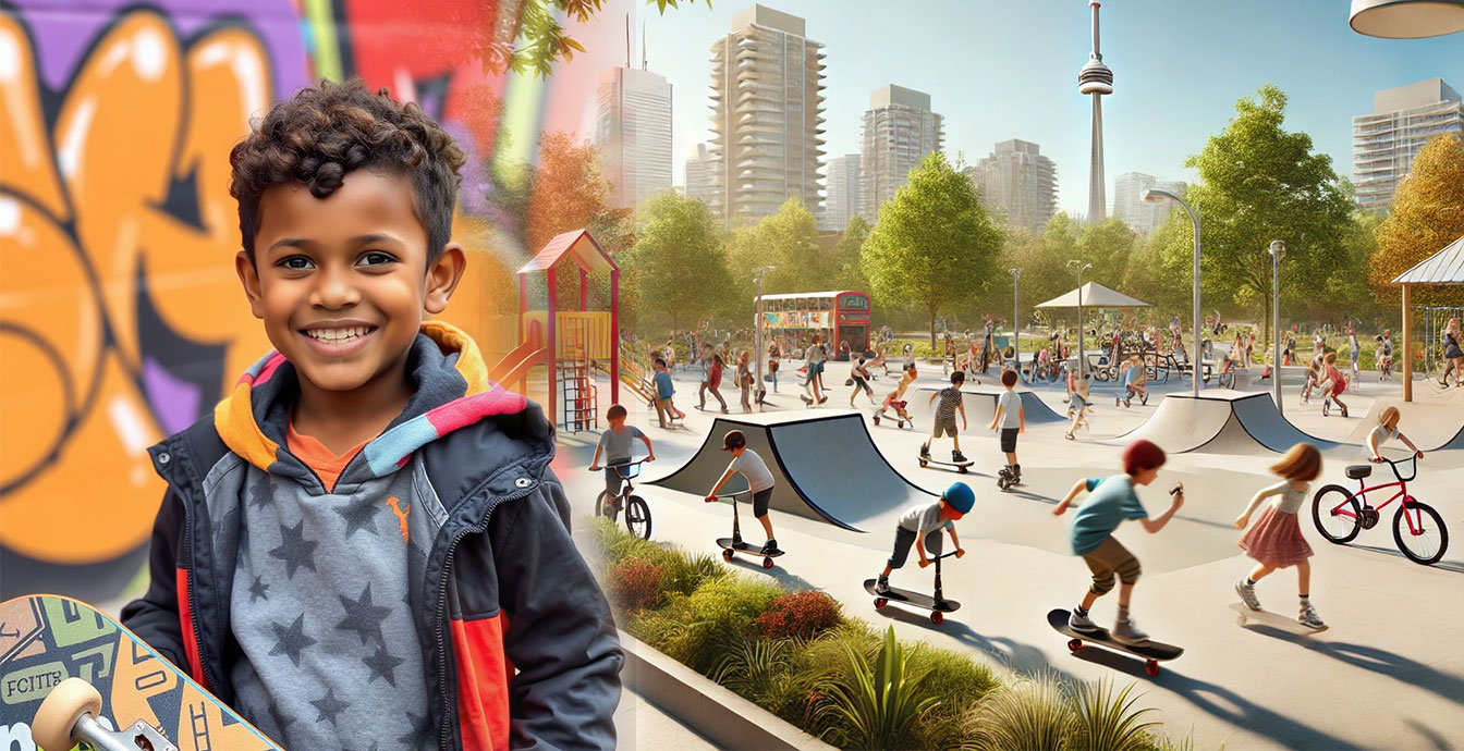
Jordan Lewis (9 years old)
Jordan is an energetic 9-year-old who loves skateboarding and cooking. He prefers active challenges over text-heavy tasks. Therefore, the app uses colorful visuals and milestones to keep him motivated. This allows him to prepare dishes independently and share his creations with friends.
Core App Features
Interactive & Age-Appropriate
The app features an engaging recipe library. Clear logic makes complex steps accessible. Thus, it fosters independence in the kitchen for young users.
Nutritional Education
Integrated tutorials provide guidance within the cooking workflow. Moreover, healthy eating tips are seamlessly included to educate children as they cook.
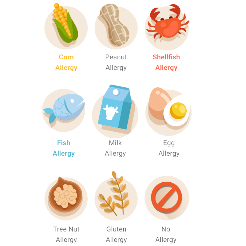
Dietary Filtering
A filtering system allows families to customize the experience. Specifically, it manages allergies and dietary needs to ensure a safe environment.
Achievement System
Users earn badges through a milestone system. In addition, this design encourages continued engagement and provides positive reinforcement for learning.
Personalized Content
The interface offer suggestions based on past interactions. Consequently, it introduces new culinary challenges that align with user preferences.
Voice Assistance
Specifically for inclusivity, the platform features voice navigation. This supports non-readers when paired with the color-coded difficulty system.
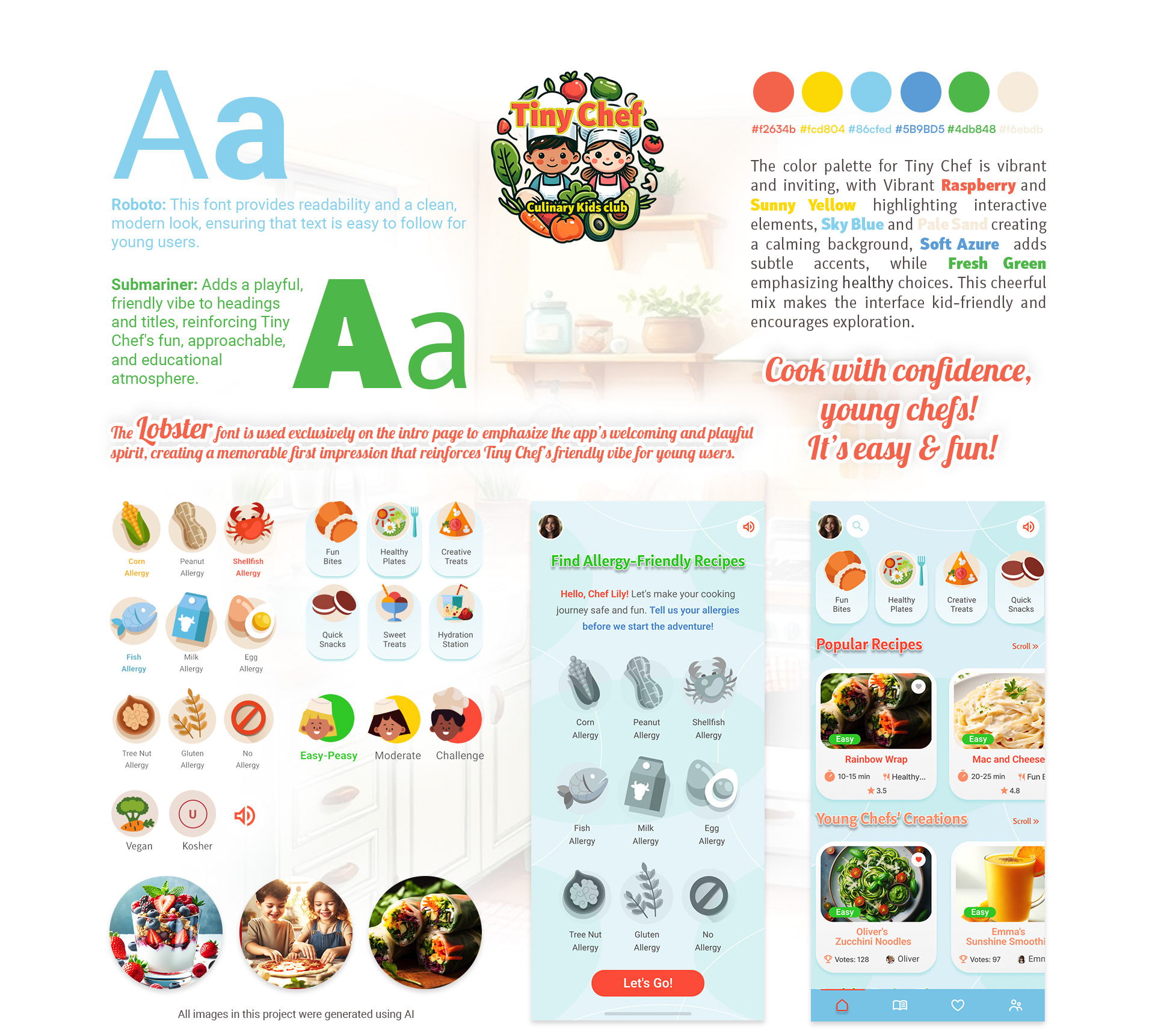
Visual Identity & Typography
The color palette for Tiny Chef is vibrant and inviting. For instance, Raspberry and Yellow highlight interactive elements. In addition, Sky Blue and Pale Sand provide a balanced background for exploration.
Roboto
Primary Interface Typeface
Clean, readable, modern.
Submariner
Playful Accent Typeface
Friendly, round, engaging.
Lobster
Intro & Special Headers
Creative, script, fun.
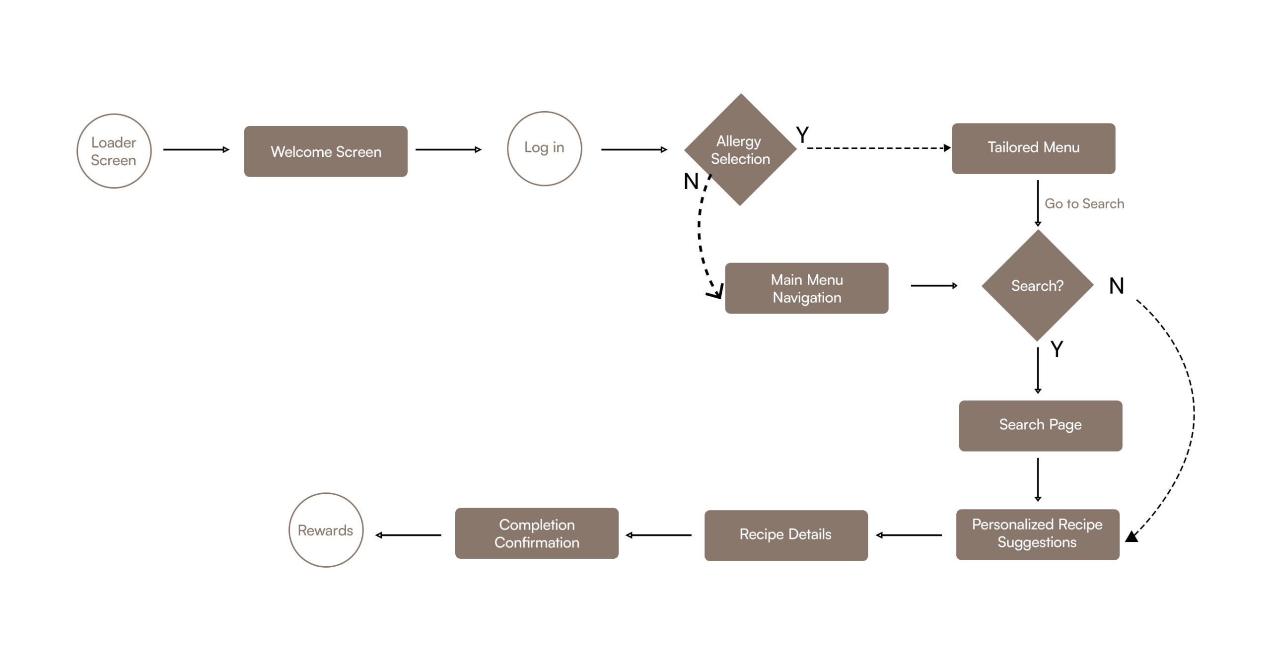
User Journey Overview for Kids Cooking App UX
Specifically, this overview outlines the interactive flow. It is designed to reduce friction and support young users through the experience.
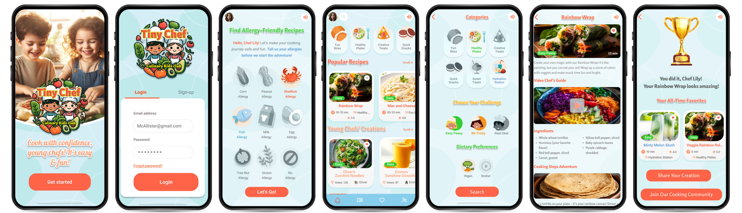
Frame 1: Loader Screen
A playful loading animation maintains interest. Moreover, it sets the initial visual tone immediately.
Frame 2: Welcome Screen
The landing view features clear imagery. In addition, a “Get Started” call-to-action directs the user.
Frame 3: Login Screen
The app provides persona-specific login options. This helps younger users bypass complex hurdles.
Frame 4: Allergy Selection
A safety checkpoint appears early. Specifically, bold iconography allows users to set dietary parameters.
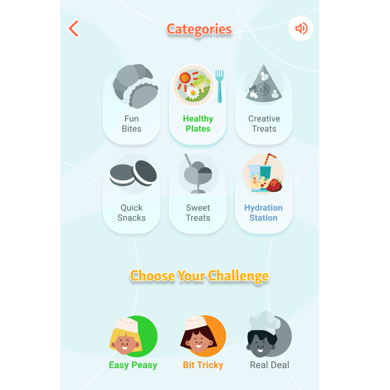
Frame 5: Main Navigation
The hub organizes recipes into categories. Furthermore, it includes voice-activation options for accessibility.
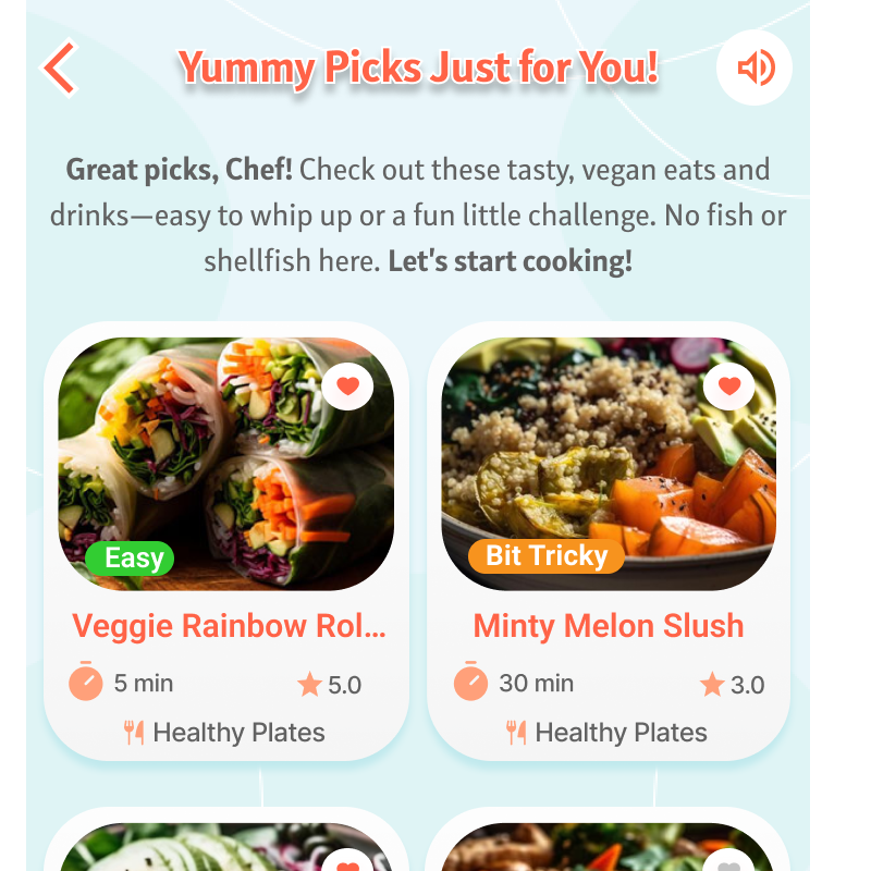
Frame 6: Search & Filters
Visual filtering helps children make autonomous decisions. This is based on time, difficulty, and ingredients.
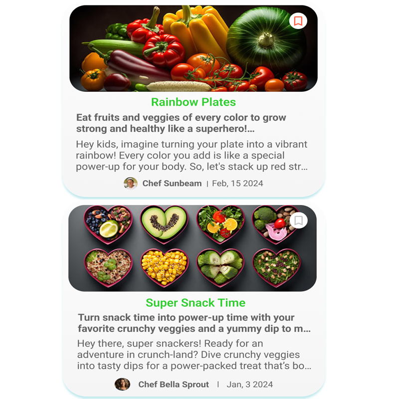
Frame 7: Personalized Results
A dynamic feed aligns with user skill levels. Consequently, it reflects the selected dietary profile.
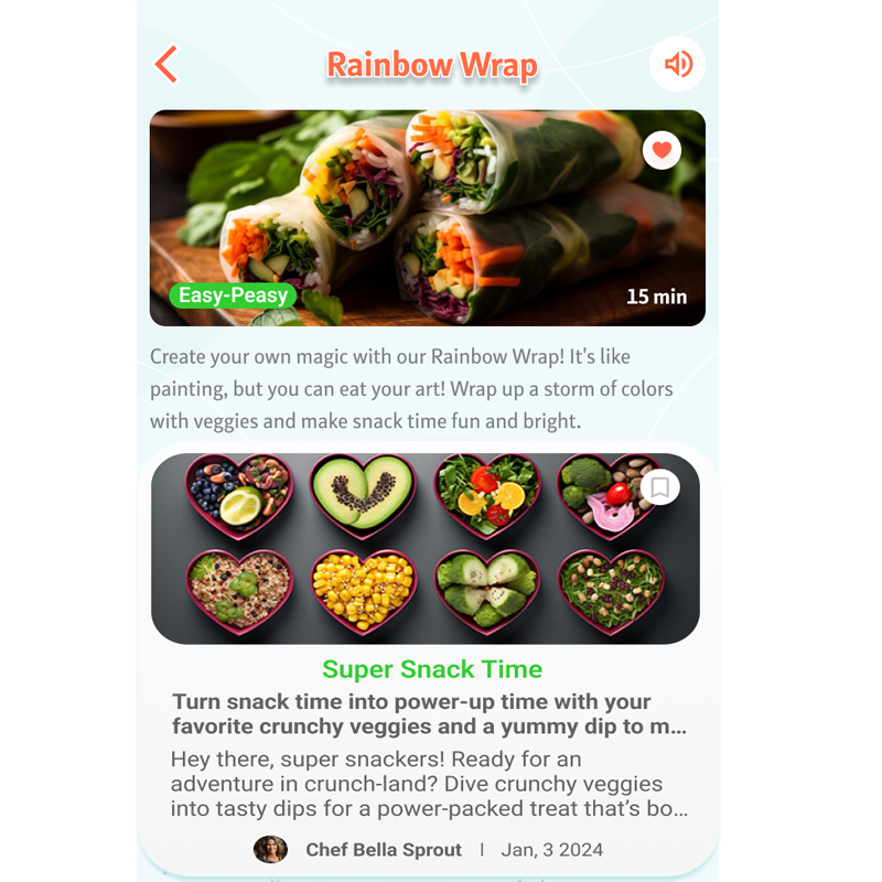
Frame 8: Recipe Execution
This phase combines video and large text. Thus, it creates a seamless and educational cooking view.
Frame 9: Completion State
The interface celebrates successful tasks. Specifically, it uses an “I did it!” button to reinforce learning.
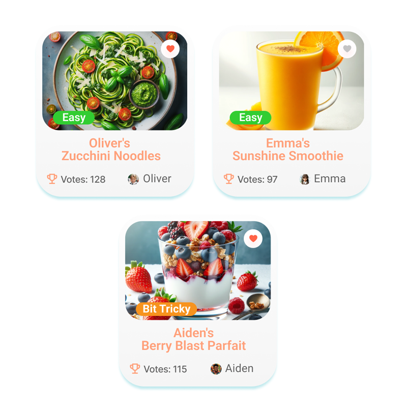
Frame 10: Community & Rewards
Users earn badges for their progress. Moreover, they can share their work with a monitored community.
Interactive Kids Cooking App UX Prototype
Experience the hands-on flow of this kids cooking app UX design. Click below to load the interactive prototype directly on this page.
Project Takeaways
Impact Statement: This kids cooking app UX case study demonstrates how accessibility and play-driven design empower the next generation of chefs. Ultimately, developing the app highlighted the importance of intuitive flows for young users. For instance, for children who do not read, clear iconography is essential. This project shows how mobile applications can combine utility with engagement. Consequently, it creates a safe experience for all children.