Product Design Case Study
Pet Adoption App | Mobile UX Design
The Product:
This project simplifies the often-frustrating process of pet adoption. Currently, finding a pet means jumping between different shelter websites, all with messy layouts, inconsistent rules, and unclear next steps. It is an overwhelming experience, especially on mobile.
I designed a unified pet adoption app that brings searching, comparing, and applying into one clear process. The goal was not just to make a pretty app, but to build a decision-support tool that helps people through the high-stakes journey of adopting a pet.
The Journey:
Adoption isn’t just a single action; it’s a long process involving searching, visiting, and paperwork. I mapped the design to cover the full end-to-end experience:
- Discovery: Seeing available pets from multiple shelters in one place.
- Lifestyle Matching: Helping users find pets that actually fit their daily lives, not just the “cutest” photo.
- Management: Creating a clear “home base” to track application statuses and appointment scheduling.
The design focuses on clarity and confidence, ensuring users feel supported rather than rushed.
My Role:
I led this project from initial problem framing through final interface design, drawing on my background as a UX/UI Product Designer.
Product Strategy
Defined a logical flow that handles complex information without overwhelming the user.
UI/UX Design
Built a mobile-first interface with clear hierarchy, informed by my Google UX Design Professional Certificate training.
Practical Thinking
Ensured the app logic reflects how shelters operate in real-world scenarios.
Outcome:
The final concept applies product and UX structure to a fragmented adoption experience. By prioritizing usability and clear flow, the design makes a complex process easier to understand and navigate.
The problem
The pet adoption experience is highly fragmented. Prospective adopters are required to navigate multiple shelter websites, each with inconsistent information, varying requirements, and uneven mobile usability. This fragmentation makes it difficult to compare options, understand next steps, and track progress across the adoption process.
As a result, users must manage discovery, evaluation, and applications manually across separate systems. The lack of a unified, mobile-friendly structure increases cognitive load and makes an already complex decision harder to navigate.
The goal
The goal of this project was to reframe pet adoption as a structured, decision-support experience on mobile. Rather than focusing on browsing alone, the design introduces lifestyle-based matching to support more informed and deliberate choices.
By centralizing discovery, application tracking, and visit scheduling into a single flow, the product aims to improve clarity and reduce friction throughout the journey. The design intentionally avoids urgency-driven patterns, using a calm and supportive visual language appropriate for a high-consideration decision.
Design process
User Research and Insights PHASE 01
I reviewed existing pet adoption platforms to identify structural and usability gaps. Common issues included inconsistent mobile layouts, unclear progression from browsing to application, and high information density without clear hierarchy.
This analysis reinforced the need for a more structured, mobile-first flow that supports comparison and informed decision-making without overwhelming the user.
Personas and Journey Mapping PHASE 02
I defined representative adopter types, including first-time owners and families with specific lifestyle needs, to guide feature prioritization and content structure.
Journey mapping ensured the transition from discovery to appointment scheduling felt linear and predictable, rather than fragmented across disconnected steps.
Sketching and Wireframing PHASE 03
Initial sketches focused on information hierarchy, filtering logic, and navigation clarity. The goal was to reduce cognitive load and establish a strong structural foundation before introducing visual design.
Wireframes were developed in Figma to refine screen density, interaction flow, and content grouping, ensuring each stage of the journey remained clear and purposeful.
Prototyping PHASE 04
An interactive prototype was created to validate the end-to-end experience. The emphasis during this phase was on usability and logical progression, particularly around comparison tools and application tracking.
The prototype was reviewed critically to identify friction points and refine transitions, ensuring the process felt intuitive and manageable.
Final Design and Handoff PHASE 05
The final phase focused on visual refinement and system consistency.
- Established a cohesive style system, including typography, spacing, and reusable components
- Ensured accessibility standards were met, including appropriate color contrast and readable font sizing
- Prepared detailed annotations to support accurate implementation of filtering logic, status tracking, and interaction states
The deliverables were organized to reflect realistic collaboration with development rather than a purely conceptual exercise.

Persona Summary
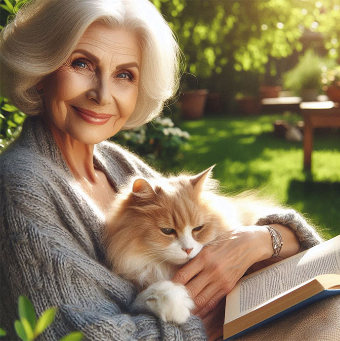
Margaret Thompson
“Margaret Thompson, a 72-year-old retired teacher, resides in a quiet suburban neighborhood with her days filled with serene garden readings she has long cherished.”
Understanding the UserMargaret Thompson is a 72-year-old retired teacher seeking a calm, low-maintenance companion animal. She lives independently and values routine, predictability, and clarity in her daily life.
She is comfortable using a smartphone but prefers simple, structured digital experiences with clear instructions and minimal complexity. Her primary concerns include understanding adoption requirements, reviewing health and temperament information, and feeling confident about next steps before committing.
Margaret represents users who benefit from straightforward navigation, readable content, and visible progress tracking. Designing for her ensures the experience remains accessible, calm, and easy to follow, particularly for users who may not be highly tech-oriented.
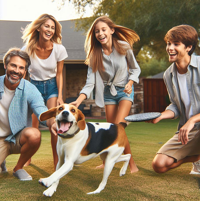
The Bennett Family
“The Bennett family, a lively and adventurous household, recently welcomed Daisy, an older beagle, into their lives. Together, they create lasting memories filled with joy, laughter, and unconditional love.”
Understanding the UserThe Bennett family represents first-time adopters with an active household. They are seeking a playful, adaptable pet that fits an energetic lifestyle and can participate in regular outdoor activities.
As new adopters, they require clear guidance throughout the process. They need transparent information about temperament, activity level, and care requirements to assess compatibility. They also benefit from structured comparison tools and clear scheduling mechanisms to manage visits and applications.
This persona informed features such as lifestyle-based filtering, detailed pet profiles, favorites management, and straightforward appointment scheduling. Designing for the Bennett family ensures the experience supports collaborative decision-making within a household and reduces uncertainty for first-time adopters.
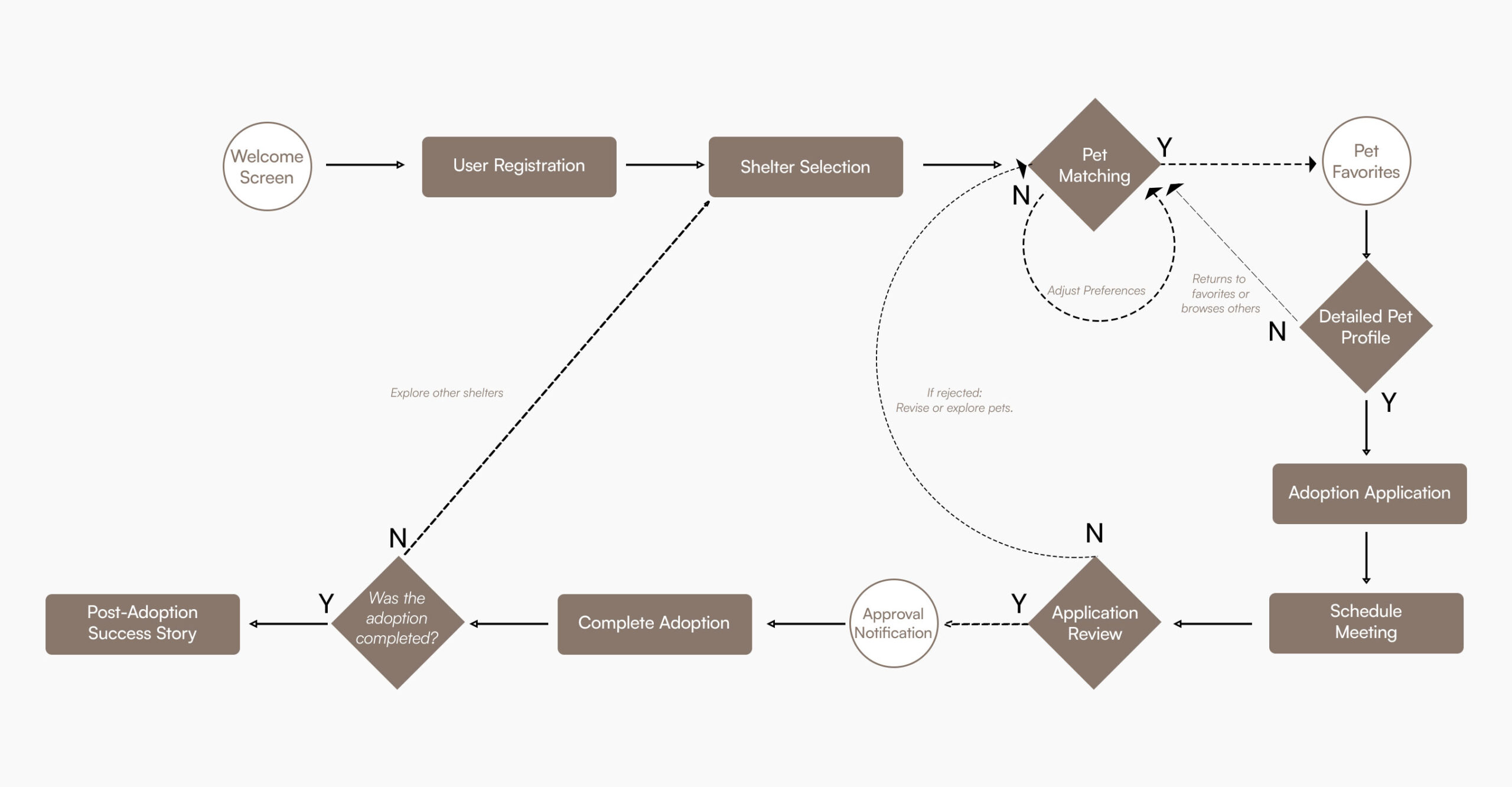
User Journey Map
The journey map outlines the structured flow of the adoption process within the mobile product. It captures key stages including shelter discovery, pet evaluation, comparison, application submission, and appointment scheduling.
Mapping the journey clarified transition points between browsing and intent, and highlighted where users need additional guidance or status visibility. It also ensured that features such as filtering, favorites, and application tracking were placed logically within the progression of the experience.
The purpose of the journey map was not to add features, but to reduce fragmentation and create a predictable, linear path through a complex process. This structure supports users in moving from exploration to informed action with clarity and minimal friction.
Pet Adoption App Features
Designing a successful pet adoption app requires balancing emotional engagement with practical utility. Here are the core features that drive this mobile experience.
Personalized Pet Matching
Advanced lifestyle assessments in this pet adoption app prioritize animals that align with your home environment and activity level, shifting discovery from browsing to compatibility.
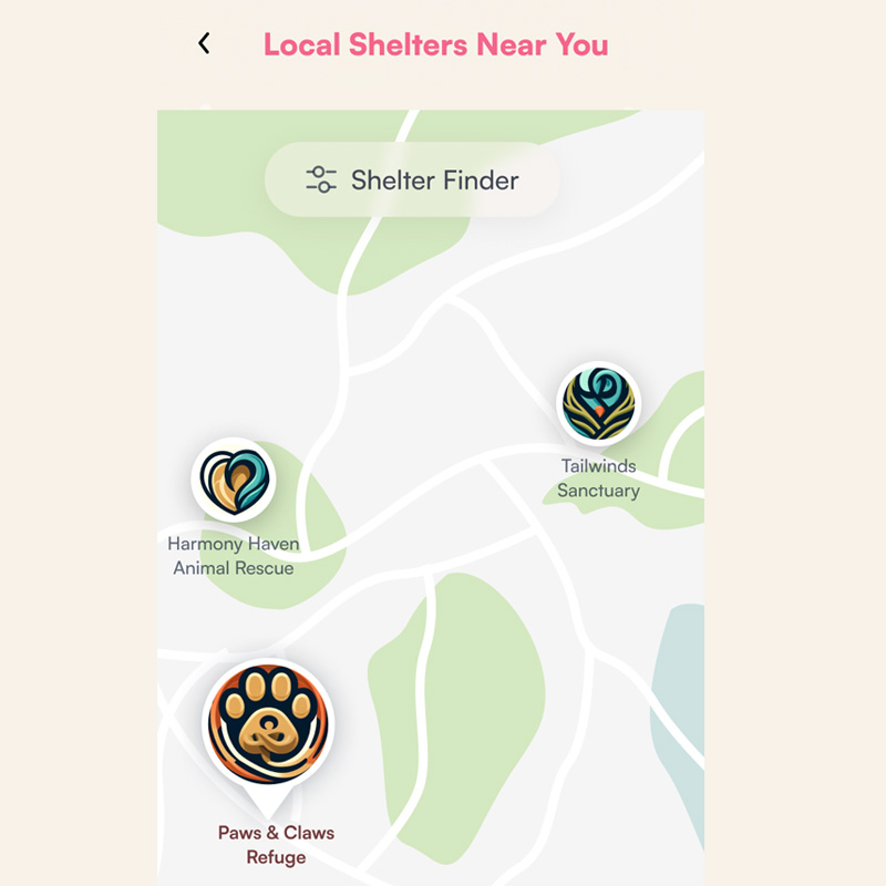
Local Shelter Finder
Interactive maps with real-time distance indicators connect digital exploration with real-world visits, making shelter discovery straightforward and fast.
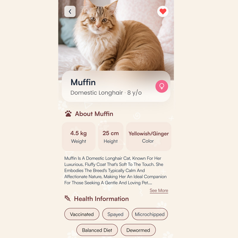
Detailed Pet Profiles
Structured profiles with temperament, health status, and medical history allow for rapid scanning and side-by-side comparison during selection.
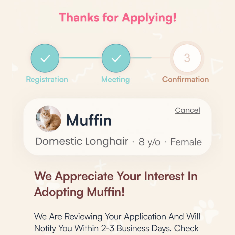
Adoption Process Tracking
Visual progress structures within the pet adoption app reduce user anxiety by showing exactly where you are in the journey, from submission to final scheduling.
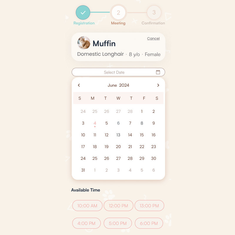
Interactive Scheduling
Integrated appointment management allows users to book visit slots directly, removing the friction of manual coordination with shelters.
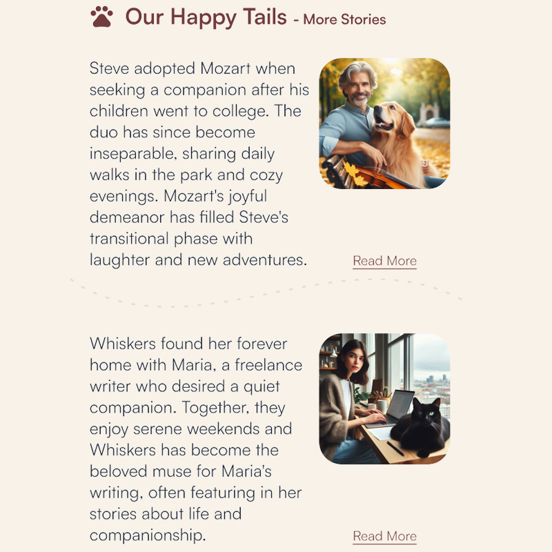
Success Stories
Ongoing engagement through community updates and educational resources supports new pet parents long after using the pet adoption app.
What Sets This Pet Adoption App Apart
FurryFriends redefines the user experience by bridging the gap between digital discovery and real-world connection. We move beyond simple browsing to offer a comprehensive, empathy-driven pet adoption app designed for both adopters and shelters.
Personalized Matching
An intelligent system that integrates lifestyle, environment, and experience to recommend ideal companions, shifting discovery from image-based browsing to true compatibility.
Interactive Discovery
Our integrated map feature simplifies finding local shelters, connecting users directly with their community and facilitating real-world visits with ease.
Seamless Flow
From initial application to built-in scheduling, our end-to-end tracking system provides clear progress updates, eliminating uncertainty throughout the journey.
Community & Connection
Success stories foster personal, emotional connections that inspire new adopters, making the process of finding a pet meaningful and stress-free.
Pet Adoption App Wireframing
The design for this pet adoption app began with identifying the core friction points in current shelter experiences. By moving from paper to digital, I prioritized information hierarchy over aesthetics to ensure a logic-driven user flow.
From Paper to Digital
I translated initial sketches into Figma to refine spacing and interaction patterns. This phase validated that a centralized pet adoption app could significantly reduce the cognitive load of prospective owners.
Accessibility First
I incorporated WCAG standards early, ensuring the interface remained usable for all adopters through consistent contrast and clear progress indicators.
Validation & Iteration
The interactive prototype served to test filtering and comparison tools—the most critical features of any effective pet adoption app.
High-Fidelity Pet Adoption App UI
The final high-fidelity product translates a complex, emotional process into a calm and supportive mobile environment. This pet adoption app ensures every step feels predictable and clear.
Core Interface Features
Structured Navigation
Discovery, comparison, and application are woven into a single, unambiguous path within the pet adoption app.
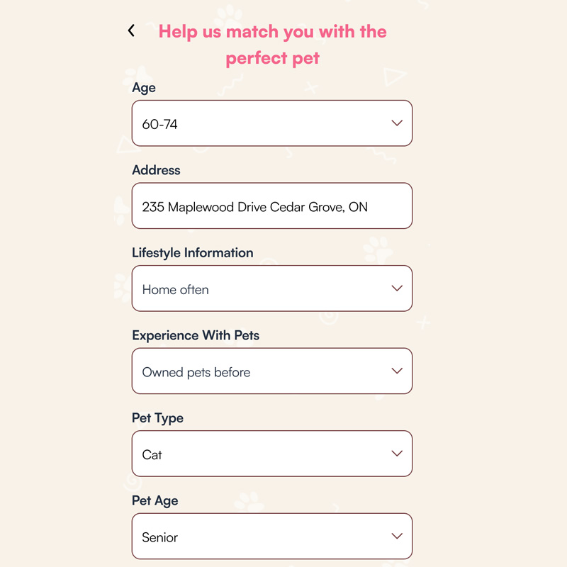
Lifestyle-Based Filtering
Moving beyond visual selection, the app uses lifestyle assessment data to suggest compatible matches.
Lifecycle Tracking
Real-time indicators remove the “black hole” of traditional applications, providing instant status updates.
Strategic Value
Operational Reality
The flow mirrors the actual approval cycles of real-world shelters, creating a realistic tool for both parties.
End-to-End Support
Beyond a marketplace, the design manages visit logistics and post-adoption community support.
Intentional Calm
A soft, neutral visual palette was selected to foster deliberate thinking over impulse adoption decisions.
Visual Identity: Strategic Pet Adoption App UI
The brand identity for this pet adoption app is built on trust, warmth, and modern efficiency. By balancing soft, organic tones with high-contrast functional hues, the system fosters emotional connections while maintaining the rigorous clarity required for successful user journeys.
Color System
Pale Ivory
#F8F2E9Primary background; establishes a calm, welcoming atmosphere and reduces eye fatigue.
Deep Wine
#723C3DAnchors the UI with reliability and warmth, used for core branding and navigation.
Soft Coral
#F1A4A1Guiding tone for friendly secondary interactions and welcoming visual accents.
Vibrant Peony
#F4658CHigh-energy accent dedicated to critical conversion points and primary CTAs.
Cerulean Frost
#62A2B1Informational contrast color for icons, links, and navigational guidance.
Midnight Blue
#212D3FCore typography color; ensures maximum legibility and professional grounding.
Logo Narrative
The FurryFriends logo harmonizes friendly imagery with geometric precision. By blending cat and dog silhouettes into a unified mark, the identity communicates the pet adoption app mission of finding ideal matches while projecting a compassionate and approachable ethos.
Iconographic Strategy
Icons serve as functional landmarks. The custom icon set is designed to simplify complex data—such as medical records—ensuring the pet adoption app remains scannable and accessible for users across all demographics.
Typography Specimen
Poppins
Selected as the primary heading font for its geometric clarity and friendly, contemporary tone. Its circular letterforms project an approachable perception, while its robust weights establish a clear visual hierarchy within the pet adoption app.
Inter / Grotesque
Utilized as the primary interface font to provide professional grounding and technical precision. Its neutral structure is optimized for high-density information—such as medical records and application tracking—supporting prolonged legibility and rapid scanning.
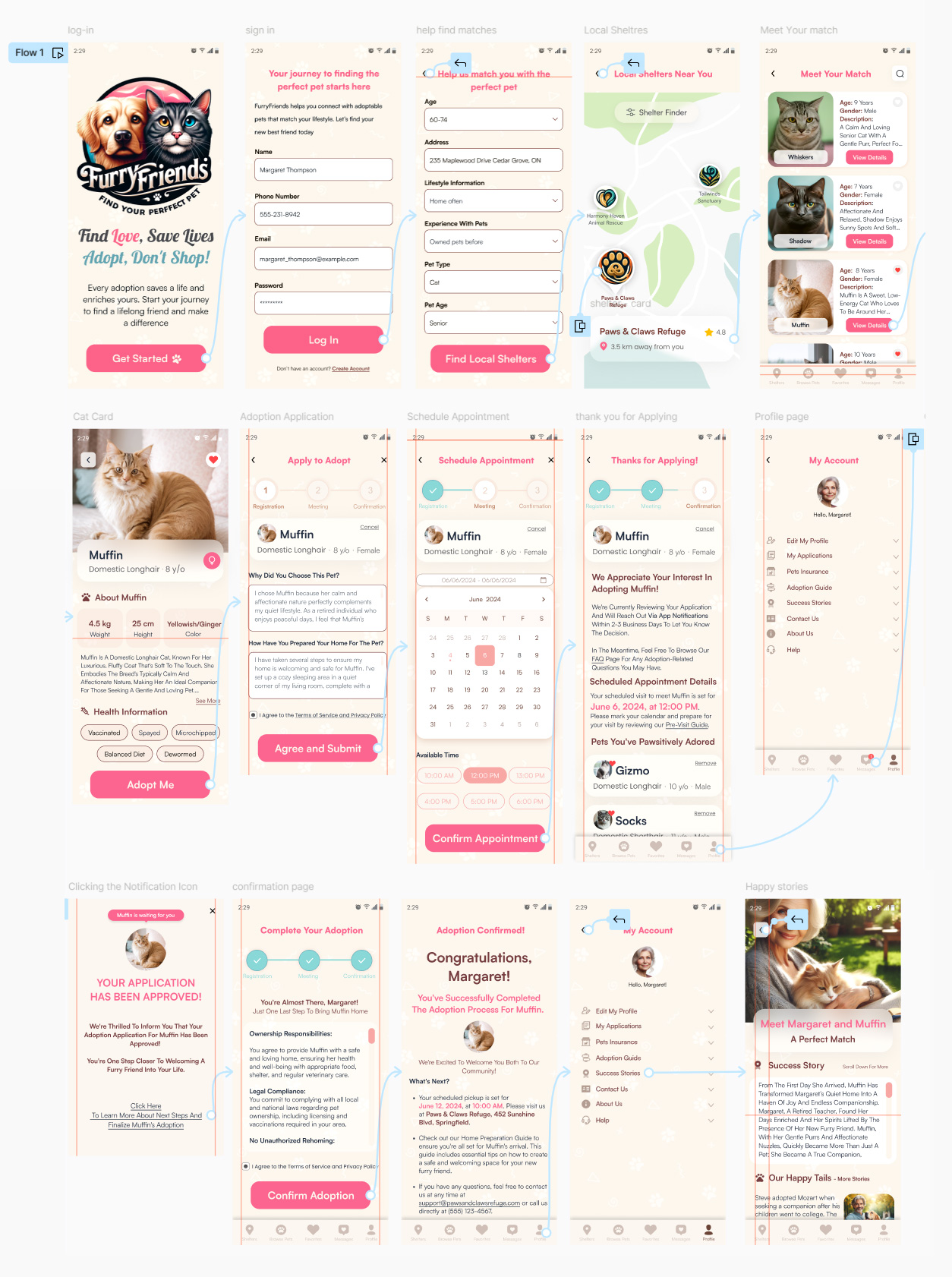
Step-by-Step User Journey
Phase 1: Entry & Personalization
Welcome Screen
Establishing an immediate emotional connection with high-clarity entry points for new and returning users.
Registration
A friction-free onboarding flow designed to transition users to active community members instantly.
Match Assessment
A strategic lifestyle quiz that pivots the search from visual browsing to compatibility-led recommendations.
Phase 2: Discovery & Matching
Shelter Locator
Geo-targeted discovery listing verified shelters with distance indicators to ground exploration in reality.
Personalized Gallery
A curated pet feed tailored to lifestyle inputs, allowing for high-intent favoriting and comparison.
Detailed Profiles
Deep-dive profiles highlighting temperament and health, balancing data with emotional appeal.
Phase 3: Application & Logistics
Application
A guided submission process that help shelters assess home readiness while ensuring compliance.
Scheduling
In-app calendar management for booking visits directly, eliminating manual coordination friction.
Approval Tracking
Real-time updates ensure users remain informed as their application moves through review.
Phase 4: Completion & Community
Dashboard
A central hub for managing applications and post-adoption guides, serving as a permanent home base.
Notification
High-impact, emotionally engaging alerts that outline immediate next steps home.
Finalization
Legal sign-off and responsibility checklists that emphasize accountable ownership.
Celebration
Transitioning the user to advocate by sharing their story to inspire the community.
FurryFriends UX/UI Prototype
Experience the complete user journey from matchmaking to final adoption. This high-fidelity prototype demonstrates the core interaction patterns and navigational logic optimized for high-consideration decision support.
Takeaways from This Project
This project showed how I can take a complicated, messy process and turn it into a simple and reliable journey. It highlighted my ability to balance clear structure with a calm, human touch, ensuring the design works for everyone—including users who need extra clarity.
Crafting this experience from start to finish allowed me to apply my senior-level thinking to a real-world problem. It wasn’t just about making a pretty app; it was about removing the stress and confusion that people face when trying to adopt a pet.
This project reminded me why I love design—it’s about solving practical problems and making a big life decision feel easier for the user. It reflects my commitment to creating professional, high-quality work that is grounded in logic and truly helps people in their daily lives.