UX Case Study: High-Conversion Booking Engine Design
Birchwood Majestic: Hotel Booking Engine
Project Overview:This case study focuses on transactional system product design for Birchwood Majestic, a fictional luxury hospitality brand. Specifically, this project covers the entire user funnel, from initial search and room selection to checkout and secure payment flows. Since mobile environments expose UX weaknesses faster than desktop, I intentionally designed this system mobile-first. This constraint forced a much stronger visual hierarchy and more rigorous flow logic.
Disclaimer: This project was created as a portfolio demonstration to represent the type of production UI and transactional systems I’ve designed professionally. Due to confidentiality constraints from previous roles, I’m unable to publicly share real client work, so this fictional booking system is used to showcase my approach to flow architecture, interface design, and production-ready UX.
The problem
Mobile hotel booking flows often fragment key decisions across disconnected screens, forcing users to repeatedly re-enter information while juggling location, dates, room options, and pricing. When availability, room details, and add-ons are not clearly structured, users lose context, hesitate, or abandon the booking during high-intent moments like selection and payment.
From a product perspective, the challenge is organizing multiple variables (location, dates, guests, room types, upgrades, and totals) into a single cohesive journey that remains readable and predictable on a small screen.
The goal
Design a mobile-first booking engine that consolidates discovery, availability, room selection, add-ons, and checkout into a continuous, structured flow. The goal was to guide users from location choice through confirmation while maintaining persistent booking context, minimizing re-entry of information, and surfacing pricing updates in real time.
The system prioritizes progressive disclosure, clear hierarchy, and persistent booking summaries, allowing users to confidently move forward while understanding exactly what they’re booking at every step.
Design Approach
This project was approached as a mobile transactional system rather than a conceptual experience.
I began by mapping the complete booking journey, from location discovery through confirmation, identifying key decision points such as date selection, room comparison, guest configuration, add-ons, and checkout.
From there, I structured the interface around progressive disclosure, ensuring users only see what they need at each step while maintaining persistent booking context (location, dates, guests, and pricing). The flow was designed to minimize re-entry of information and reduce friction during high-intent moments.
High-fidelity prototypes were built in Figma to define layout logic, component behavior, and interaction states, resulting in a production-ready UI that clearly communicates system structure and flow sequencing.


Booking Scenario
This project models a real mobile hotel booking journey, guiding users from destination selection through date choice, room comparison, optional add-ons, and final checkout within a single, uninterrupted flow.
The interface preserves key booking details — location, dates, guest count, and total price — throughout the process. By keeping this context visible at all times, the system supports fast decision-making and reduces friction during high-intent booking moments.
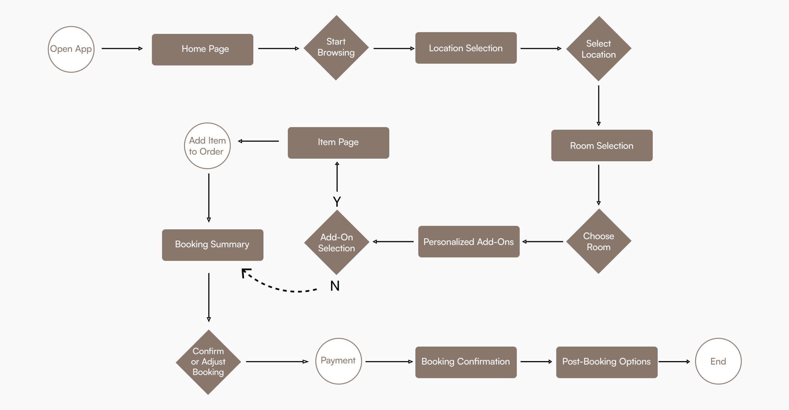
User Journey Map
This journey map defines the end-to-end mobile booking flow, from discovery to confirmation. The experience is structured to separate exploration from transaction, guiding users through location selection, room choice, optional add-ons, and checkout in a clear, linear path. Key decisions are surfaced progressively, with a persistent booking summary supporting transparency and confidence before payment.
Key Features
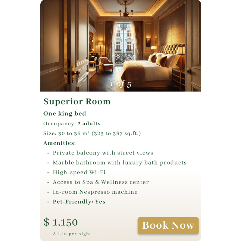
Browse available rooms with clear layouts, detailed descriptions, and location-specific visuals, allowing users to compare options and make decisions quickly.
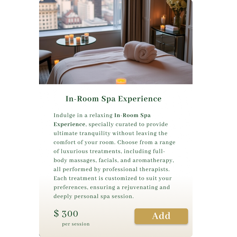
Optional services such as in-room spa treatments and private chauffeur rides are presented after room selection, supporting upgrades without disrupting the primary booking flow.
Pricing is displayed transparently throughout the experience, helping users understand total costs in real time and confirm selections with confidence.
A structured interface provides fast access to locations, dates, rooms, and booking details, reducing friction across every step of the journey.
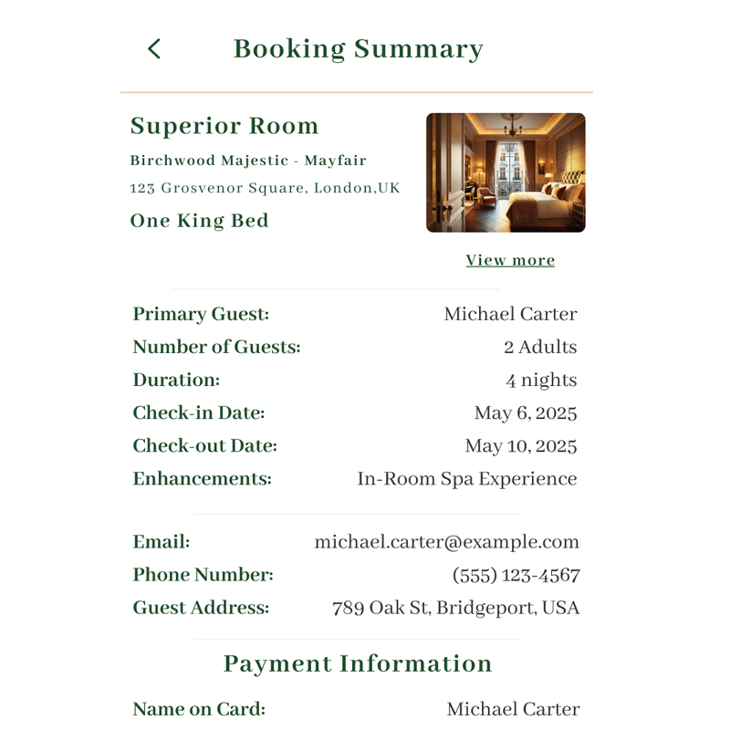
Users receive a complete booking overview before payment, followed by immediate confirmation, reinforcing trust and reducing uncertainty at checkout.
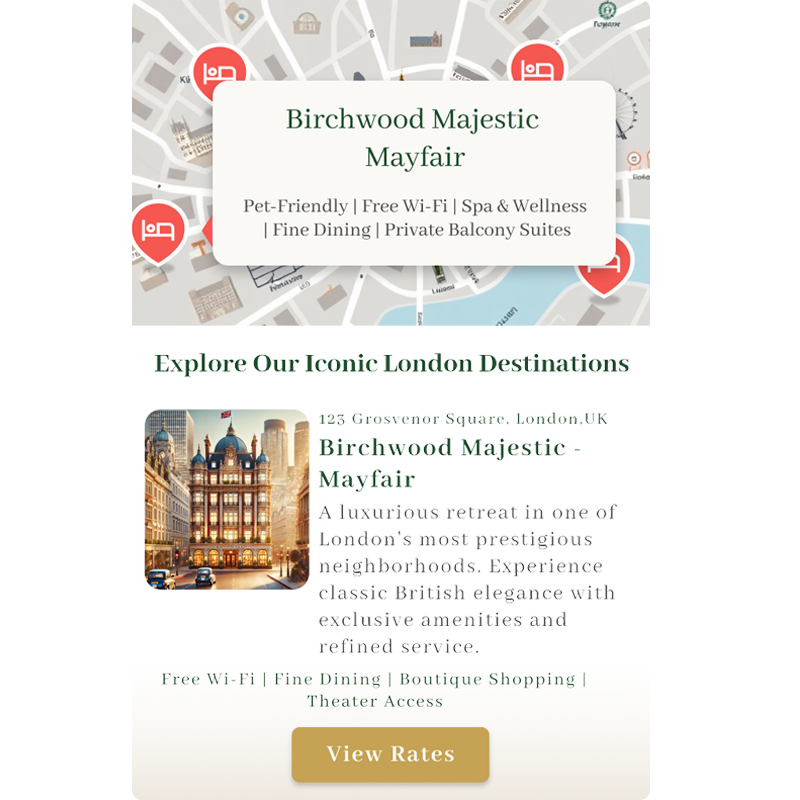
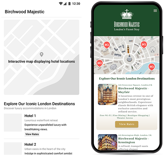
An integrated map enables users to explore hotel branches, view available locations, and access property details directly from map pins for fast location-based selection.
Refining the Design Process
The process began by defining real booking scenarios for busy, luxury-focused travelers, outlining how users discover locations, compare rooms, and complete reservations. These scenarios informed the initial structure of the booking flow and helped clarify priorities across the experience.
I created a detailed user flow covering location selection, room choice, add-ons, and checkout. Early sketches and low-fidelity layouts were used to quickly validate hierarchy, navigation, and screen structure before moving into digital wireframes aligned with the brand.
Once the core flow was established, I developed low-fidelity prototypes to test navigation patterns and feature placement. These were refined into high-fidelity interactive prototypes, where visual design, branded components, and interaction states were finalized.
This iterative progression from rough exploration to production-level UI ensured the booking experience remained focused on clarity, efficiency, and real-world usability while maintaining Birchwood Majestic’s luxury aesthetic.
End-to-End Booking Flow
This flow illustrates the complete mobile booking journey, from initial discovery through room selection, personalization, payment, and confirmation. The experience was designed to reduce cognitive load while guiding users through a complex transactional process with clear steps, optional enhancements, and continuous cost visibility. The goal was to create a streamlined, production-ready flow that balances efficiency with a premium hospitality experience.
Crafting Luxury Through Color and Design: The Visual Identity of Birchwood Majestic
Abhaya Libra
The selected typography features Abhaya Libra, a Latin design that evokes an excellent feeling of refinement while providing high readability and a perfectly balanced display presence throughout the user journey.
Step-by-Step User Journey: Birchwood Majestic Booking Process
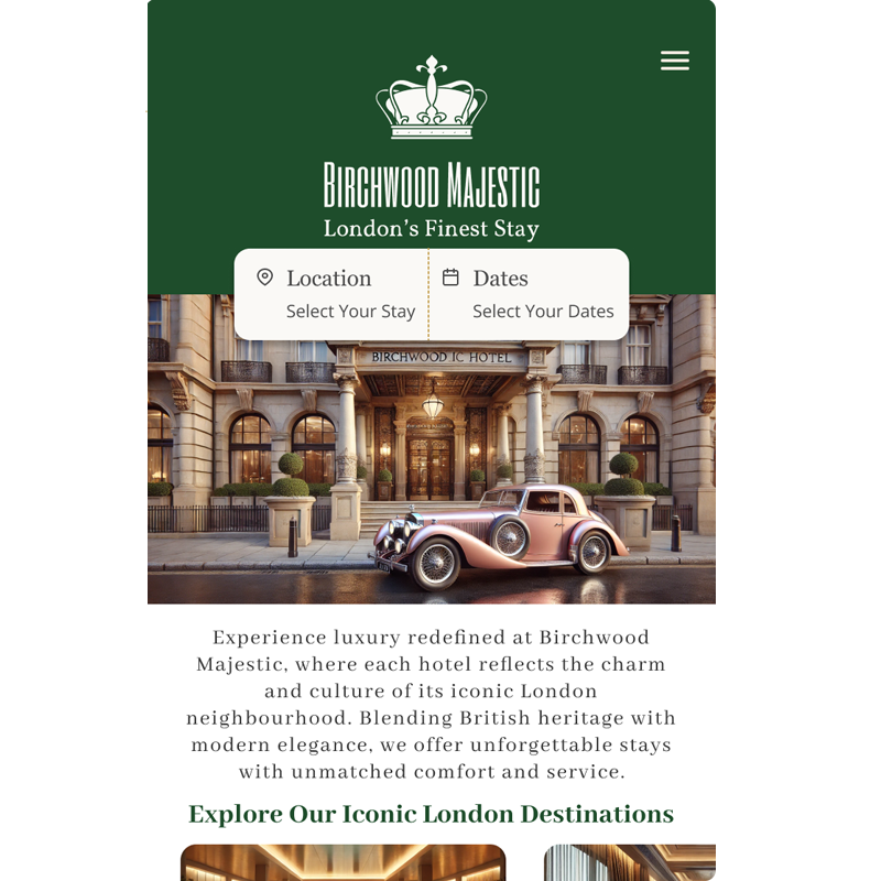
Home Screen
Introduces the brand while immediately guiding users into booking, minimizing time-to-first-action.
Location Selection
Allows users to compare Birchwood Majestic properties visually before committing.
Choose Your Date
Enables quick selection of check-in and check-out dates without leaving the flow.

Guest/Room Selection
Collects details on occupancy before availability is shown to ensure relevance.
Room Selection
Allows users to browse available room types for the selected location and dates.
Stay Enhancements
Integrated add-ons directly into booking logic as personalized stay enhancements.
Review Screen
Summarizes all booking selections including rooms, dates, guests, and add-ons.
Final Booking
Captures guest information and payment details to finalize the reservation.
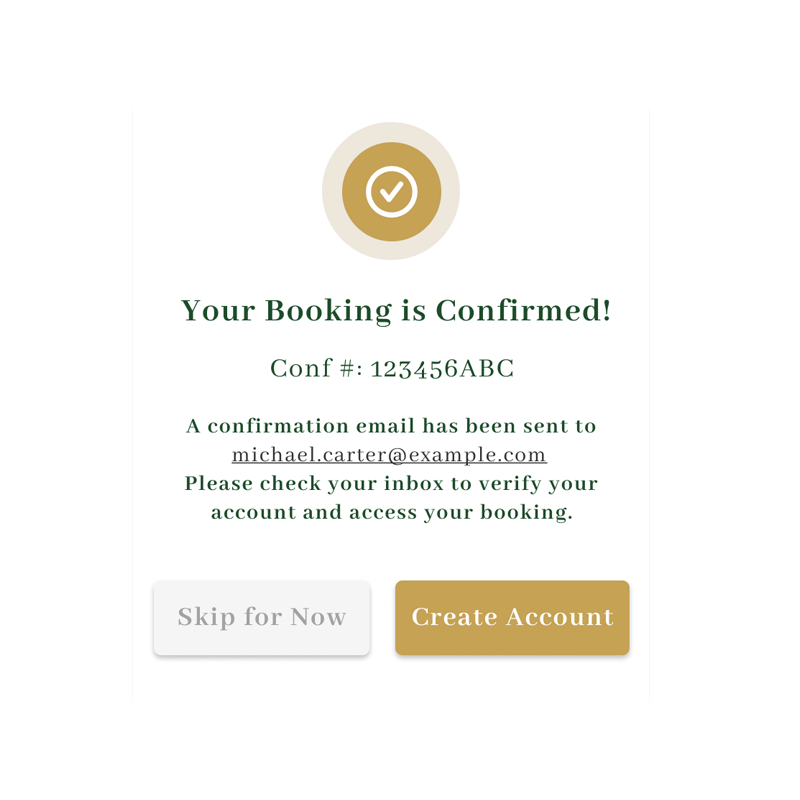
Confirmation
Confirms the reservation and presents next steps immediately after payment.
Birchwood Majestic UX/UI Prototype
Experience the interactive flow of the hotel booking engine. This prototype demonstrates the seamless transition between discovery and conversion, optimized for high-intent luxury travelers.
Takeaways from This Project
Designing the Birchwood Majestic hotel booking system reinforced how essential it is to transform complex booking flows into structured, easy-to-follow digital experiences. Drawing on years of experience in hospitality UX and transactional interface design, this project focused on reducing friction through simplified steps, persistent pricing visibility, and clear decision support.
Balancing luxury branding with usability required creating an interface that feels premium while remaining practical and accessible. Every interaction was designed to support high-intent booking behavior without interrupting the flow from room selection to checkout.
This project brings together years of experience in hotel booking platforms, transactional system design, and operational logic into a refined, modern booking experience built for real-world hospitality environments.
Ultimately, it reflects my approach to product design in the hospitality industry: aligning user expectations with business requirements to create scalable, dependable booking systems.