Sugar Bliss Bakery App Design
Sugar Bliss is a custom bakery app design created to bridge the gap between digital convenience and real-world bakery operations.
Customers want speed and certainty. Bakeries operate within strict daily capacity. The product was built to remove uncertainty around availability and pickup timing while keeping the experience fast and simple.
For time-constrained professionals like Olivia, the app delivers a predictable checkout experience. For reliability-focused users like Ethan, it guarantees that every order reflects real-time availability.
Bakery App Design Strategy
System Support Highlights:
- Real-Time Availability – Displays only items supported by current baking capacity.
- Streamlined Checkout – A focused ordering flow built for high-intent mobile users.
- Immediate Confirmation – Clear pickup details provided instantly post-payment.
The UX Challenge
Solving Critical Pain Points:
- Guaranteeing availability before the user makes a physical trip.
- Providing predictable pickup windows for busy professionals.
By aligning user schedules with business capacity, Sugar Bliss creates a dependable retail experience.
Design Approach: Solving Persona Friction
Rather than starting with production limits, I focused on the tension between user expectations and ordering reality. Olivia needed speed without hesitation. Ethan needed certainty without risk. The system removes friction by translating real-world constraints into simple, automated digital rules.
Certainty
Verified Availability
Every order reflects real-time stock, eliminating the risk of last-minute disappointment.
Velocity
Smart Scheduling
Only valid time slots are shown, allowing busy users to complete orders quickly.
Integrity
Authenticated Checkout
Login reduces ghost orders and protects availability for serious buyers.
Experience
Clear Confirmation
Immediate pickup details and location guidance remove uncertainty at handoff.
The Roadmap: From Strategy to Execution
Phase 01
Operational Logic
Defined timing rules to ensure availability could be trusted by the user.
Phase 02
Structural Framework
Designed navigation flows to support fast decision-making and checkout.
Phase 03
Visual Systems
Created a clean interface that makes customization feel simple and direct.
Phase 04
Technical Alignment
Documented validation behavior to ensure systems matched intended intent.

Strategic Personas: Bakery App Design for Intent

Olivia Mitchell
The Time-Constrained ProfessionalAs a Marketing Manager with a tightly scheduled day, Olivia values convenience and efficiency. She represents a high-intent customer who lacks the time for physical browsing and relies on a seamless bakery app design that guarantees a fast, reliable pickup.
Design Impact
Olivia was used to stress-test the transactional flow, ensuring the interface minimizes cognitive load while preserving precision in scheduling and checkout.

Ethan Anderson
The Reliability SeekerEthan is a freelance designer who balances a shifting workload with family commitments. He depends on a system that guarantees product availability, ensuring that he can uphold family traditions without the risk of last-minute stock issues.
Design Impact
Ethan’s profile validated the availability logic. The design prioritizes inventory transparency and clear confirmation to remove friction for users planning around rigid schedules.
User Journey Map: Bakery App Design
This bakery app design journey map functions as a blueprint for aligning digital interaction with physical bakery operations. By mapping the progression from category exploration through customization and pickup scheduling, the system establishes a predictable and fulfillment-aware ordering path.
| Phase & Goal | User Action & Operational Logic |
|---|---|
|
Discovery
Exploration
|
Dynamic Discovery Loops
User navigates between promotional banners and product categories. The logic supports exploratory behavior while increasing exposure to high-margin seasonal items.
|
|
Selection
Intent Capture
|
Deferred Authentication
User adds products to the bag without the friction of early login. This “Lazy Registration” strategy prioritizes conversion by capturing intent before requiring account verification.
|
|
Validation
Capacity Check
|
Operational Logic
User selects a specific pickup window. The system validates this against the bakery’s real-time production constraints, ensuring the digital order is physically fulfillable.
|
|
Transaction
Secure Checkout
|
Decision Mapping
User completes payment once the inventory and pickup slot are locked. This sequence prevents transactional errors where a customer pays for an unavailable time slot.
|
|
Fulfillment
Trust & Loyalty
|
Fulfillment Integrity
User receives immediate confirmation with location details and estimated wait times. This transparent handoff sets clear expectations for the physical in-store experience.
|
Key Features: Sugar Bliss Bakery App Design
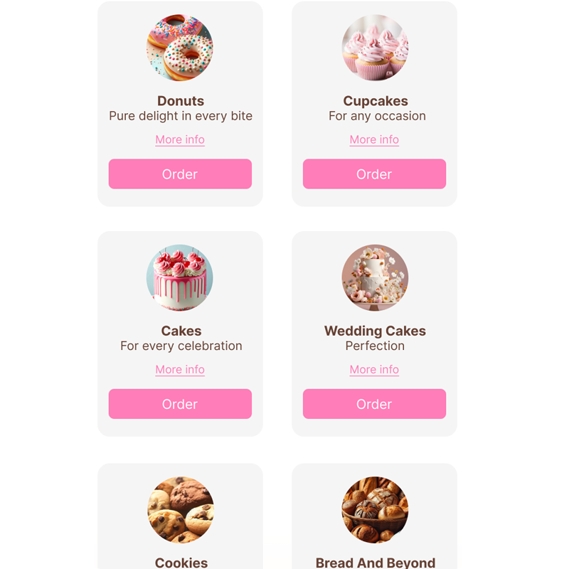
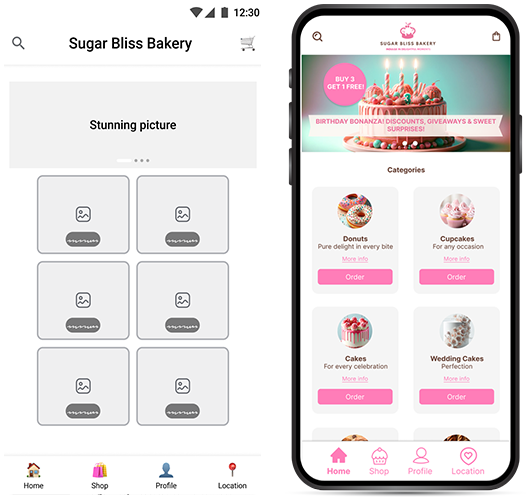
Intuitive Category Architecture: This bakery app design organizes products into clearly defined categories such as Donuts, Cupcakes, and Artisanal Breads. As a result, users can move efficiently from exploration to selection without unnecessary friction. The structured hierarchy reduces cognitive strain and shortens the path to purchase.
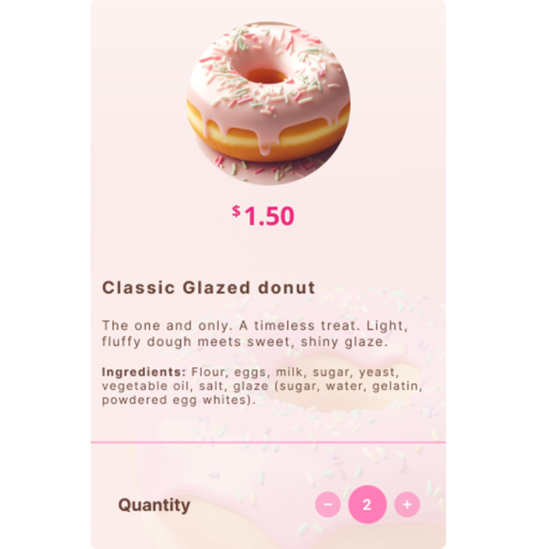
Advanced Product Customization: Each product includes configurable options for flavor selection, quantity adjustments, and dietary preferences. Consequently, users can tailor their selections while maintaining clarity within the transactional flow. This structure ensures custom orders are captured accurately before entering the production process.
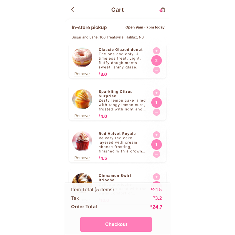
Real-Time Cart Synchronization: The shopping cart updates dynamically as selections are made throughout the ordering journey. Therefore, users can review and modify their order before checkout. In turn, this real-time feedback reduces errors and strengthens confidence in the transaction.
Integrated Pickup Scheduling UX: Pickup scheduling is embedded directly into the checkout sequence. Available time slots reflect operational capacity and preparation timelines. As a result, digital ordering behavior aligns with real bakery production constraints and ensures accurate fulfillment.
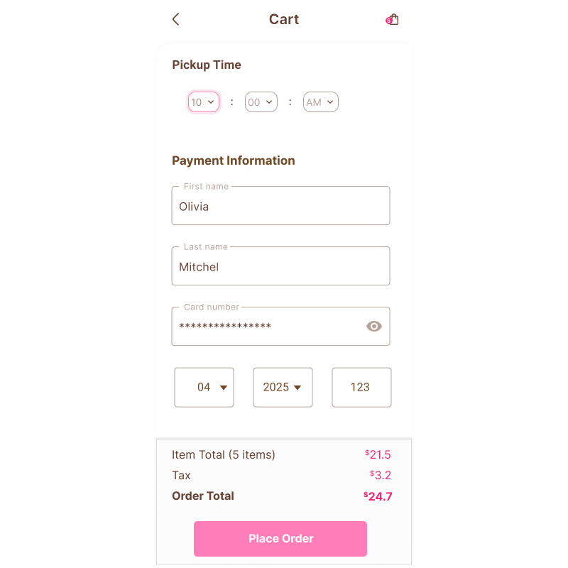
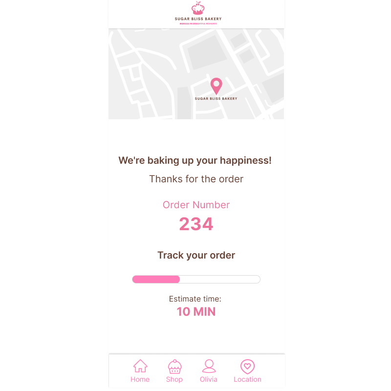
Order Confirmation and Fulfillment Transparency: After payment, the confirmation screen provides estimated pickup time, location details, and a unique order reference number. In addition, this documentation reinforces reliability and supports a seamless in-store handoff.
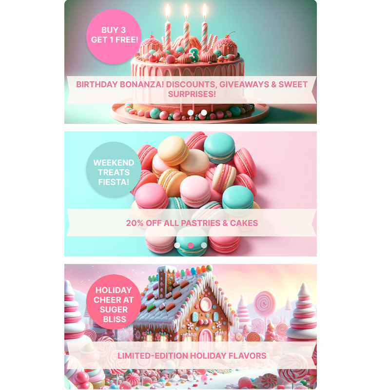
Promotional Strategy Integration: Seasonal banners and limited-time offers are incorporated without disrupting the primary ordering flow. Consequently, the design supports revenue objectives while preserving usability. This balance allows the bakery to promote high-value items without compromising the user experience.
From Friction to Form: Bakery App Design
Strategy & Logic
This bakery app design began with persona frustration. Olivia needed speed. Ethan needed certainty. These needs shaped the interaction rules before any visual styling was applied.
Low-Fidelity Validation
Wireframes were used to test flow, hierarchy, and checkout clarity. The goal was to remove friction and confirm that availability, scheduling, and authentication worked logically.
High-Fidelity Execution
Once the structure proved reliable, the interface evolved into a warm, bakery-appropriate visual system — balancing aesthetic appeal with operational control.
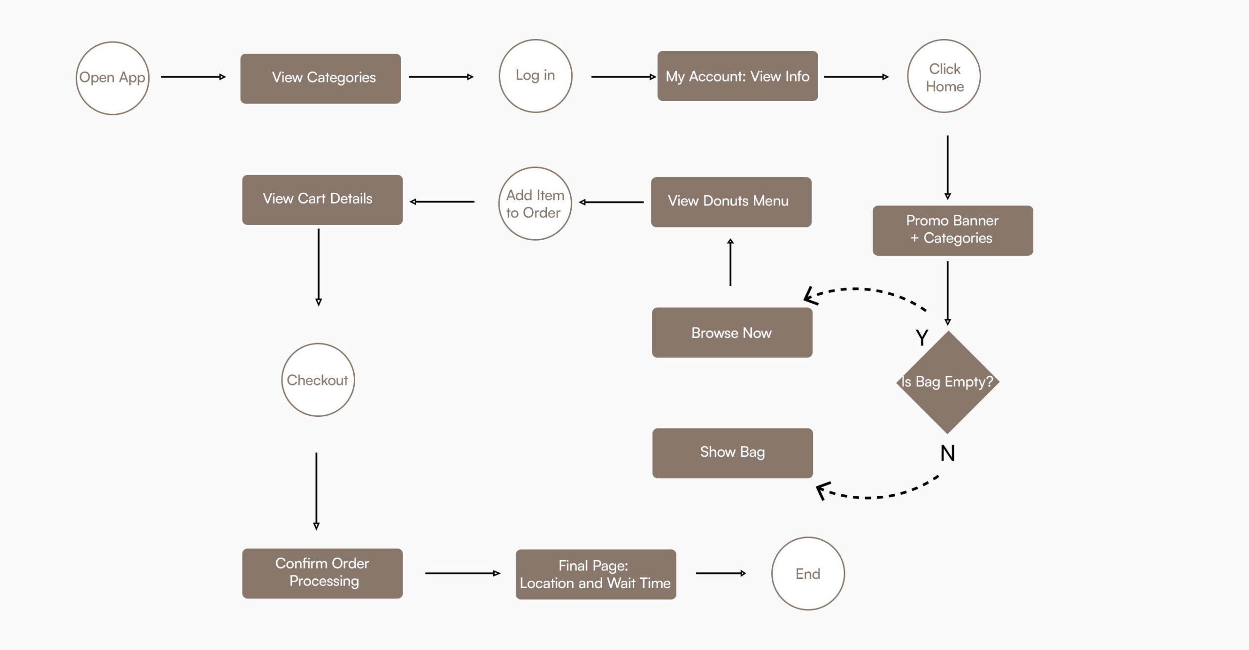
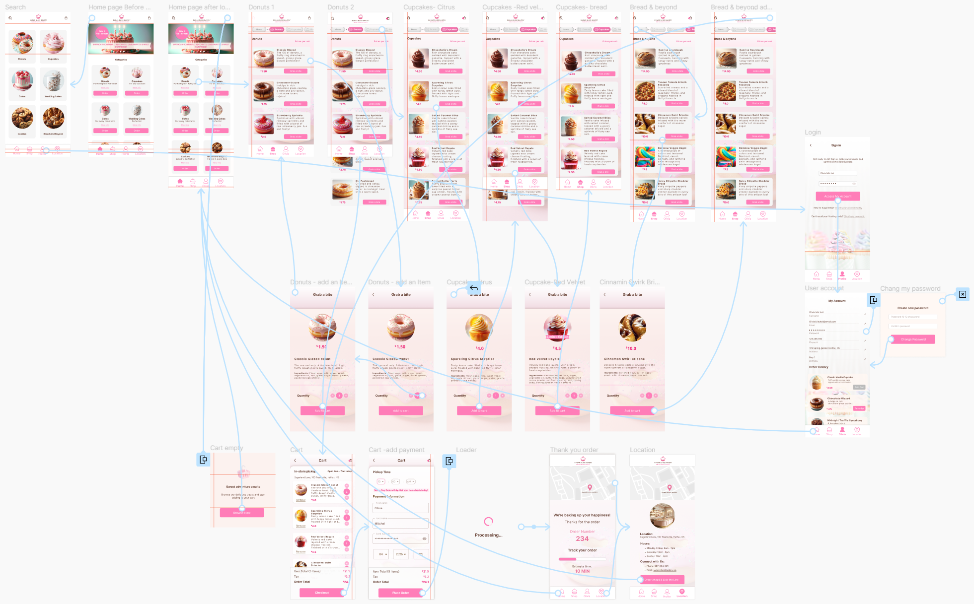
High-Fidelity Prototype Flow
The diagram below shows the complete ordering flow from category browsing to final confirmation.
Each step reflects the core design principles outlined earlier: controlled availability, automated scheduling, authenticated checkout, and clear handoff. The system ensures users move from exploration to pickup with speed and certainty, while operational rules quietly protect capacity in the background.
This flow demonstrates how user intent and business constraints are synchronized through structured interaction design.
Crafting Delight Through Color and Design:
The Visual Identity of this Bakery App Design
The visual identity for this bakery app design was developed to balance brand warmth with functional clarity. The color palette supports hierarchy, interaction states, and accessibility while reinforcing the artisanal character of the bakery. Each hex value was selected not only for aesthetic alignment but for its role within the transactional interface.
Inter Typeface
Inter was selected for its clarity, scalability, and clean structure. The typeface ensures legibility across mobile breakpoints while maintaining a contemporary aesthetic. Its disciplined geometry balances the expressive color system, resulting in a cohesive visual language that supports usability and operational precision.
User Journey & Business Strategy
The ordering journey shows how browsing, scheduling, and pickup align with real bakery capacity. By guiding users from exploration to confirmation, the system creates a predictable and dependable experience.
Exploration
Users can browse freely while availability is controlled in the background to prevent selecting unavailable items.
Commitment
Mandatory login protects inventory and reduces unverified orders.
Validation
Scheduling enforces real capacity limits before checkout, aligning expectations with actual fulfillment.
Confirmation
Clear pickup details and live status updates reduce uncertainty at handoff.
Interactive Bakery App Design Prototype
Experience the seamless flow of my custom-built mobile application. This bakery app design focuses on high-fidelity visual storytelling and a frictionless ordering system.
Note: For the best experience, please view this prototype on a desktop browser. Some elements may not display optimally on smaller mobile screens.
Prioritizing a logic-first approach allowed for seamless navigation that caters to high-intent users. By aligning the UI with real-world bakery constraints, the system facilitates faster transactions and reduces drop-off rates.
Establishing a cohesive color system and modular layout reinforces brand trust. This architectural discipline ensures that the visual identity scales across new product categories without compromising the polished, inviting user experience.
Integrating customizable pickup scheduling directly into the checkout flow solves a critical friction point. This feature balances customer convenience with operational capacity, ensuring reliability for both the user and the business.
Designing for modularity ensures the platform can integrate future features, such as seasonal promotions or loyalty programs. This scalability prevents disruption during updates, protecting the long-term value of the digital asset.
Reflections & Takeaways on this Bakery App Design
This project reinforced the importance of aligning digital experience with real operational constraints. Designing for busy users required more than speed; it required clarity, predictability, and reliable pickup scheduling.
By combining structured navigation, a disciplined visual system, and integrated fulfillment logic, this bakery app design supports both usability and business operations. The result is a scalable, transaction-focused platform that balances brand personality with functional precision.
Explore More Systems
In addition to this bakery project, you can view how I handled high-density logic in the Birchwood Majestic Hotel Booking Engine or explore mobile-first accessibility in the FurryFriends Pet Adoption Case Study.